It’s an all too regular occurrence that great products find their way onto shop shelves but fail to make the final and most important hurdle. Getting to the retail stage is a big achievement in its self, but if products can’t find their way off the shelves for the end sale, all hard work is in vain. In today’s market place, to stand any chance of selling, products need to catch the customer’s eye.
Product packaging is the last line of marketing support, so it needs to be treated with this level of importance. Regardless of how much time and money is pumped into sales teams, marketing and advertising campaigns, product packaging artwork needs to stand out on the shelf and be recognised.
As experts in the packaging industry, we’ll share with you our definitive rules for product packaging artwork that is sure to fly off the shelf.
Keep it simple
Packaging artwork needs to tell the consumer 2 things; what the product is for and who the brand behind it is. If a person browsing the shelves can’t find this information in 3 or 4 seconds, then the design is fundamentally wrong!
You’d be surprised just how regularly brands get product packaging wrong by missing out the basics and obsessing over bright colours and listing product information without saying what they’re selling.
Visual impact
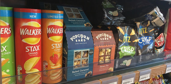
In a retail situation, there’s very little chance that a product will be displayed on its own or in a lot of detail, so packaging artwork needs to be visible from a distance.
Packaging will usually be arranged in rows and columns, so design should consider that packaging needs to be eye catching from the front and it should form an aesthetically pleasing pattern to catch the shopper’s attention as they walk by. It’s important to consider that even packaging art that looks great individually might disappear into nothingness when placed on a shelf – it’s the simplest designs that tend to pop.
Be authentic
The essence of a truly great brand is originality and an immediately recognisable character. A brand should be authentic to stand out. Once a brand has achieved a level of authenticity, any packaging needs to meet the visual standards that have been set. It’s easy to get carried away trying to be different, but this could have a negative impact if you step too far away from the authentic brand you’ve developed.
Expansion and adaptability
Any product packaging art concepts should be easily adaptable should you wish to extend the product line. For example, in the food and beverage market, if new flavours or product variations are introduced, it should be easy to create artwork variations without losing any of the visual appeal of the original product.
When creating an initial design concept, it’s important to consider how you could expand the brand in the future. Will your product packaging allow for this?
If you would like to talk about your product packaging, call us today on 01256 352415. We’re here to help you create packaging that makes its way off the shelf just as fast as it gets there.
